



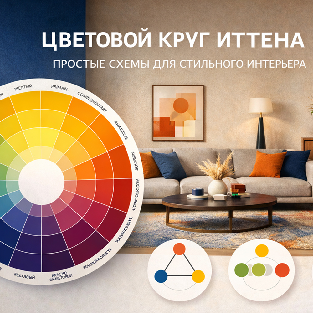
Working with color is more than just choosing your favorite shades. It’s a language that can express the style, mood, and character of your space. At the heart of harmonious combinations is an understanding of how colors interact with one another. One of the most useful tools for this is Itten’s color wheel, a classic system created by the Bauhaus artist and teacher Johannes Itten, which makes it easy to create balanced and expressive color palettes for interiors.
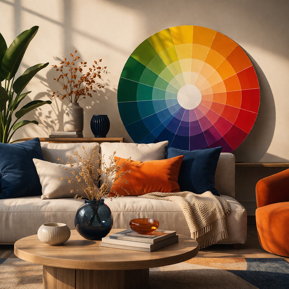
The color wheel is a circle where primary, secondary, and tertiary colors are arranged in order, reflecting their relationships. It doesn’t include black or white, since these tones serve as a backdrop and complement any palette. The focus is on chromatic colors: red, yellow, blue, and all their derived shades.
One of the most recognizable schemes is the complementary combination pairs of colors located opposite each other on the wheel. This creates strong contrast and dynamic energy, making accents bold and expressive. For example, deep blue paired with soft orange can form the basis of a living room, where one zone plays an active role while the other softens and balances the space.
For a more complex but still balanced solution, there’s the triadic scheme. In its classic form, three colors are equally spaced around the wheel, forming an equilateral triangle. This scheme works well in vibrant, lively interiors where different elements: walls, furniture, textiles create a sense of cohesion through carefully planned color harmony.
To soften contrasts and make a space feel calmer, designers use an analogous palette colors that are next to each other on the wheel. This approach emphasizes smooth transitions rather than bold clashes and is particularly suitable for relaxation areas or bedrooms, where creating a cozy, serene atmosphere is key.
There are also more complex combinations based on four colors. A tetradic scheme uses four evenly spaced colors on the wheel, allowing for a rich, dynamic interior where each color plays a distinct role while remaining harmoniously connected. A rectangular tetrad is a softer variation, with color pairs opposite each other but with gentler transitions between them.
Beyond these schemes, there’s one simple yet elegant approach: monochromatic design, which uses a single color in different shades and intensities. This classic choice is perfect for minimalist interiors, where expressiveness comes not from the number of colors but from the depth and nuance of a single tone.
Understanding the color wheel helps not only with decorative choices but also with functional spatial planning. Bright complementary pairs can energize a living or dining area, soft analogous tones can make a kitchen cozier, and monochromatic schemes work well in relaxation zones or home offices, where minimizing distractions is important.
The most important rule to remember: color should work in space, not just exist. It sets the tone of a room, highlights architectural features, and helps create the mood you want to feel every day.